Thursday 27 February 2014

The Logic

Back To Basics

For the last few days I have been looking again at the logic behind this Image Quality Tool, re-jigging the scoring of parameters (now Rev. 1.2) and having a closer look at different image manipulation tools and their likely impacts.  

I have revamped and uploaded a couple of additional videos on the IMAGE QUALITY TOOL page explaining the logic, hopefully in clearer detail.  

One video presents the parameters once again and should hopefully illustrate their relative importance in terms of the makeup of an image and the likely impact of each parameter in bird ID terms.  

Another video presentation details the relative scoring which I have now changed quite a bit from the original version (current version is Rev. 1.2).  Again the relative importance and scope of each of the parameters should hopefully jump out from that presentation.

Lastly I have included the video presentation below, exploring different types of common digital image manipulation tools.  Once again I would appreciate comments from the expert photographers out there.  

Q. Have I accurately depicted each of the image modification tools?  

Q. Have I missed any obvious tools?  

Q. Have I under or over-estimated the likely impacts upon image quality and bird identification due to the over-use of any of these tools?

Q. Where might you suggest I should next focus my research?

I am very conscious that many people view image manipulation with contempt.  Some of that may come down to a lack of understanding about what each of the tools are for and what they do to the image and it's data.  It is true to say that modification and re-saving of JPEG images will erode and compress the data further, but if the net affect is that it makes an ID possible, surely it is worth the modification.

Needless to say modifications which fundamentally alter the image and embellish the truth are not acceptable in bird ID terms and must be found out and discouraged.

I'll readily admit that I have only a relatively basic understanding myself of many of the intricacies of each of the tools, the algorithms involved and how different tools might impact negatively on bird images.  However I tend to keep an open mind.  One of the purposes of this blog is to tease out some of these questions, without hopefully getting too technical in the process.

Initially when I started wrestling with the question of digital image manipulation I assumed that I was opening a Pandora's box and that it would be far safer to put out a blanket stipulation that only the original, unmodified images should be used with the tool.  Then I realized that most birders and rarities committees alike probably make do with images published on line or cropped and sent via email, or indeed, printed and supplied with a written submission. Images transmitted over the internet tend to have been modified and re-saved in many cases.  Having pondered each of the commonly used modification tools, I am feeling a bit more upbeat as it were regarding their relative impacts for bird ID.  For the most part I feel that standard exposure, contrast and colour manipulations should not be too concerning.  Some of the other tools may be more damaging when over-utilized.

At worst the Image Quality Tool will fall slightly foul of these manipulations and inadvertently score an image higher than perhaps it deserves to be (see earlier posting FOOL THE TOOL).  Many of these standard manipulations I have found tend to actually aid identification if used properly.

Over-manipulation tends to introduce some obvious image artefacts so if someone has been over-zealous with a sharpening tool or a noise-reduction tool hopefully the Image Quality Tool will properly compensate for that.

In any case I am going to leave the Image Quality tool alone for now and call a halt to any more tinkering with relative scorings etc.  In my next posting I hope to display a good series of images which have been scored using the tool (Rev. 1.2).  Hopefully this will prove the value of the tool to those who may be a little sceptical at this point. 

Lastly, thanks again to those who have responded in private.  I hope I have taken on board all your comments in Rev. 1.2 of the tool and you find these additional videos of benefit.


Also related and worth a look - CSI RAW.
   

Monday 24 February 2014

Image Quality Tool - Fool the Tool

Re-sized Images

An easy cheat for the Birding Image Quality Tool would be to take an image which scores poorly because of low pixel resolution and simply re-size it bigger.  Now all of a sudden it contains as many pixels as a much better resolved image.  

It is surprisingly difficult to detect such a simple cheat I have found.  You might assume the image would contain obvious duplicates of each pixel but this may not always be the case.  The image editing software may re-compress the image and re-touch its sharpness a bit, masking any obvious aliasing of pixels.

The best solution to avoid this is to ask the photographer to supply the original, unaltered JPEG, or ideally RAW format image if available.

I came across a really cool website while researching this question called

The website allows you to upload an image which it scans looking for evidence of image manipulation.  
Using this site I was able to detect an obvious difference between an image which I simply re-sized and re-saved compared to the original unaltered image so there are ways and means to detect a fraud.

However this is a a lot of effort to go to for typical birders or rarities committees.  One downside to simply re-sizing an image to beat the pixel resolution test is that the image will appear softer and more pixellated, plus more valuable data may have been lost to image compression.  I will look at the relative scoring of the resolution and focus tests again to try and compensate for someone trying to dupe the tool under these circumstances.

I now have a couple of tweaks to make so I will get on and have a go at REV. 1.2 of the tool.


Sunday 23 February 2014

Forensics - CSI RAW

JPEG v's RAW

With this blog I will be opening up a few different lines of enquiry.  I won't confine it to a pursuit solely for the ideal Birding Image Quality Tool.  I also hope to explore interesting and relevant areas like:-

  • Human Bias
  • The Human Eye and Brain V's the Camera Lens and Processor
  • Forensic Analysis of Photos
  • etc.
Here is a touch of forensics.

Though a lot of birders are big into photography and many shoot in RAW or RAW + JPEG people don't tend to make RAW files available for close scrutiny.  I must admit I have only recently bothered to process some of my own photos with RAW and it has been a real eye-opening exercise.  

A JPEG is a compressed image file.  It is compressed to save space, allowing more images to be stored on a camera's storage card, it's convenient for emailing, websites, adding to documents etc.
One of the downsides with JPEG is it is a LOSSY FORMAT which means data is permanently discarded when a JPEG is made from an original RAW file and this data cannot be retrieved unless the original RAW file has been saved alongside.  If the image was only created in JPEG and there was no RAW file available or saved (many compact cameras, camera phones don't provide RAW files) this data is lost forever.

JPEGs also lose additional data every time they are re-edited and re-saved.  The greater the level of compression, the greater the loss of fidelity.  Another problem with JPEGS is that they often contain small image distortions called COMPRESSION ARTEFACTS which, like any other artefact can obscure valuable details.

For a birder trying to identify a difficult bird from a relatively poor image, one of the greatest frustrations is the not knowing what the true potential of the image could have been.  RAW images contain so much more potential locked within their data than JPEG images.   Below I have rather simplistically shown what happens when a JPEG is made automatically by a camera processor.  

Let us imagine that a particular original RAW file has captured 7 fine details which would all greatly help with the ID of the subject bird.  When the JPEG is made by the processor the processor of course has no idea what may be relevant from a bird ID perspective.  It applies a compression logic plus some user-defined settings and spits out a JPEG which may or may not preserve the details we are looking for.  In the example below the JPEG produced automatically by the camera has preserved 4 of the 7 details captured by the RAW image.  

If we have access to the RAW file we can create our own JPEG image from it having adjusted various settings to display all of the critical details we are after.


Having access to the RAW image files is a big advantage and well worth pursuing if you are faced with a very difficult ID from one or more images.  Of course, with the best will in the world, it may not be possible to improve much on the camera's original attempt.  Here I compare on the left a jpeg produced by the camera versus on the right a JPEG which I produced from RAW.  I was trying to bring out the throat-strap feature, a key marking that would help confirm an ID of Pacific Diver.  

Unfortunately the image quality is simply not good enough to confirm this ID feature, even with the RAW file as backup.  Note: Black-throated Divers can occasionally show a false throat-strap (Mullarney & Millington, 2008, Birding World 21 (2)).


Here I have an image of a 1st winter Kumlien's Gull which I photographed in Dingle, Co. Kerry in January, 2014.  The day was bright and I didn't get a chance to correct exposure before the bird took flight.  It was somewhat over-exposed in the original JPEG and much of the detail was burnt out as a result.  Luckily I was shooting in RAW + JPEG and I was able to retrieve the detail I was looking for in Camera Raw (Adobe, Version 8.3).


Saturday 22 February 2014

Exposure Exposed

Exposure

A big thanks to those who have been in touch, especially those who pledged to help with the project.  
Special gratitude here to Phil Jeffrey for sharing some of his expert photographic knowledge.  

Phil wrote re my description of overexposure

"...probably describes something closer to an optimally exposed image (ETTR) because definitionally contrast goes down when you start truly saturating images (in the pixel counter way i.e. clipping).  You fall afoul of using saturation in two ways (colour saturation as a good thing, generally, but you also use as pixel over-saturation in a technical way).  
Your description would also rate a correctly-exposed Blackbird (Euro or Icterid) on a snow field as being pathologically over-exposed, and a Snow Bunting on a black sand beach as being pathologically under-exposed.  What you need to say is that the exposure needs to be adjusted to maximise the tonal range of the subject, while minimising the number of burnt out (white) or deep shadow (black) pixels in that subject.  Even then that's technically too bright (blackbird) or too dull (snow bunting) an exposure but it's closer to what you want to achieve.  Given that the image is likely to be JPEG that's the situation to put one in the strongest position to post-process control for exposure and colour.  A technically correct exposure male (Euro) Blackbird probably conveys less information than it might, anyway."
As stated in the introduction to this blog, this is not a photographic tutorial or a technical exercise but I really do appreciate expert intervention like this.  If it looks like I am going off on a tangent in a technical way please feel free to advise as Phil has here.  

Below I have taken various exposures of a test image and laid them alongside each other to illustrate the impacts of over-exposure and under-exposure on detail and colour.  Under-exposure tends to be less of a problem.  We have a greater chance of reversing the effects of under-exposure and drawing detail and colours out of our image.  With over-exposure the effects tend to be more damaging.  I know some photographers intentionally under-expose their images to try and avoid BLOWN HIGHLIGHTS, i.e. patches of severe over-exposure in their images.

I have illustrated the relative impacts of moderate and major under-exposure and over-exposure on this particular test image.  I have rated the relative impacts on detail and colour on the right as they appear to my eye.  Others may have a different take.

I am beginning to think that I should probably alter the scoring in the quality tool for under-exposure relative to over-exposure.  I should probably negatively score over-exposure more severely than under-exposure.  One for Rev. 1.2 I guess.  Again your input here would be greatly welcome.


Thursday 20 February 2014

Parameter #5 - Artefacts

Maximum Score - 10/100

See current scoring methodology HERE

Photographic Artefacts could be described as any distortion of the image.  I think its important to separate normal exposure and white-balance variations from this discussion.  I think the term artefacts are used a bit too loosely at times.  Really what we are talking about here are:-

  1. Atmospheric distortions (eg. heat haze, moisture etc.)
  2. Lens distortions (eg. lens distortion, lens flare, chromatic aberration etc.)
  3. Camera sensor anomalies (eg. noise, faulty pixels, pixel bleed etc.)
  4. Processing anomalies (eg. focus halos, de-mosaicing, compression artefacts etc.)
I am not going to claim an expert knowledge on too many of these phenomena.  For the most part their effects are limited and may go largely unnoticed.  Where they do surface and may pose a significant problem for identification purposes is when a low resolution, badly exposed and heavily processed image surfaces.  The potential is exists for some of the artefacts above to completely throw an identification so it is an area that needs close attention.  I hope to do a lot more research in this area in due course and will put my findings up on the blog.

For now I hope you have read enough and seen enough here to get involved, try out the image quality methodology for yourself and let me know how you are getting on.

Parameter #4 - Colour

Maximum Score 15/100

See current scoring methodology HERE

White-balance

We have just come through a stormy winter here in Ireland.  I spent much of my winter morning commutes to work over the winter thinking about how I would approach this project and one of the highlights of that time was renewing my appreciation for lighting in all its complexity.  Winter light in Ireland is ever-changing.  The morning commute has been all about "the blue hour" before sunrise, when the first rays of sunlight passing through the upper atmosphere are scattered by the gas molecules in the air and some of the the lower wavelength, blue portion of the light spectrum rays get directed down towards the ground.  The world is bathed in blue.  Then, at sunrise there is an instantaneous shift from blue to yellow as direct sunlight pushes its way through the thick atmosphere and predominantly the red and yellow longer wavelengths of the spectrum dominate the lighting conditions.  This is the "golden hour".  

The phenomenon is RAYLEIGH SCATTERING.

For the remainder of a mid-winters day here in Ireland the sun barely creeps above the horizon.
The golden hour light is replaced by a dull yellowish light which never reaches the crispness and brightness even of an early morning in mid-summer.  

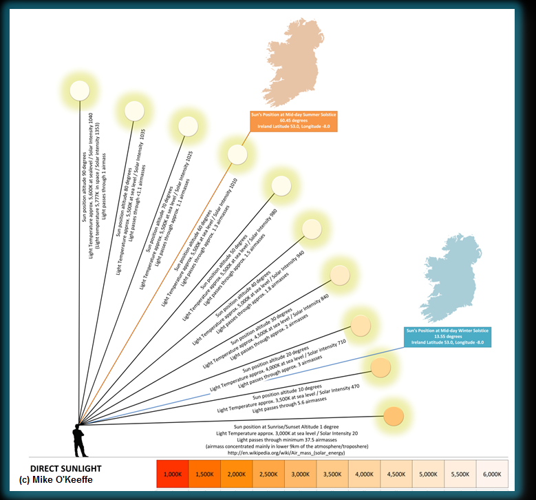
The image below depicts the sun's position in the sky in Ireland at mid-day on both the shortest and the longest days of the year.  Light must pass through 3 to 4 times more air (termed air masses) at mid-day in mid-winter in Ireland than it does at mid-day in mid-summer and the affect is to make the light, and the sun itself look more reddish-yellow in winter.  Come early morning in mid-summer in Ireland the sun is already much higher above the horizon, high enough in fact that sunlight is white-looking to our eyes at that point.  


A blue sky is a product of the same phenomenon.  This scattered blue light from the sky is itself in effect a second light source which illuminates everything from every angle.  If you have ever looked at images taken on the Moon or in space you will have noticed everything looks contrasty and the shadows are deep and black.  No details can be resolved within these deep shadows.  

Here on Earth we can readily pick out objects that are in total shade.  Even in the shade they are being illuminated by light coming from the sky and in some cases perhaps reflected light from other surfaces nearby.  This blue sky light should always be borne in mind when looking at birds photographed under shade - they are in effect being illuminated by a blue-filtered light.  This blue cast will affect their apparent colouration of everything it touches.

In the animation below I have depicted a map of the sky as it appears in mid-summer versus mid-winter.  Some of the notable points to look out for are as follows.

In mid-summer here in Ireland true nighttime is not really achieved.  We have a protracted dusk which leads directly into dawn.

In summer the sun quickly reaches a point high enough above the horizon that light colour temperature stabilizes and remains thus for a long period of the day.  In contrast mid-winter lighting is in a constant state of change from dawn till dusk as the sun never really gets high enough in the sky to clear the dense atmosphere.  Nights are long.

You will notice I have added a splash of pink (or more accurately magenta) after dusk.  We dont see this every evening but its not uncommon.  Where it occurs in the west around sun set it is related to atmospheric conditions.  However it also occurs in the east soon after sunset.  In that case the phenomenon is called ALPENGLOW and is easiest observed in areas with high mountain backdrops to the east.  

For a more complete and detailed look at lighting in all its various hues I strongly encourage you to visit this LINK.


And that is just the start of it...

Below I have depicted an array of lighting conditions frequently encountered while observing and photographing birds.  Note how colour, light intensity and shadows vary under different lighting conditions.  The ideal conditions for viewing and photographing birds are a bright, overcast day  when the sun is high in the sky and therefore the light at its purest.  At all other times we must assume that the ambient light is unpredictable and ever-changing.


Just how important is colour anyway?

There is now a field guide for western palearctic birders which has no colour plates and merely uses text to convey critical identification features including colours.  It covers 1,350 species occurring in the region, or over 10% of all bird species.  The Advanced Bird ID Handbook by Nils Van Duivendijk has broken the mold and has been a great success among experienced birders.  What strikes me most about this approach is that if we can do without plates, including their accurate depiction of colour in birds, is colour assessment really all that necessary for identification at all?

So far much of the focus in our Birding Image Quality Tool has been on the capture of detail.  
75% of the total score as accounted for so far has been weighted on RESOLUTION, FOCUS and EXPOSURE.  Good exposure is key to the capturing of rich, saturated colours.  Under-exposed images are under-saturated and can suffer from digital artefacts such as noise.  Over-exposed images tend to be over-saturated and bleached looking.  Colours appear washed out.

As indicated above, another principal factor affecting accurate colour rendition in images is white balance.  Again if you are not already well versed on all of this please visit the excellent CAMBRIDGEINCOLOUR.COM website for some useful tutorials.

When I started working on this project it dawned on me that I would need to try and weigh up each of the image quality parameters in some logical way and try and establish if some parameters were more important than others.  I opened up my 2nd Edition Collins Bird Guide (Svensson et al) and started working my way through the book, noting down the top three identification criteria for each species and for males, females and immature plumages.  I could have completed the same exercise using Duivendijk.

It quickly became obvious that colour is not a priority in the identification of most birds so it became clear why Duivendijk was able to do without plates.

Leaving aside bird sounds and jizz, neither of which are relevant to this discussion, I quickly discovered that the following tends to be the order of priority for bird identification (at least in this part of the world).  

(1) FINE DETAIL (eg. fine feather detail, subtle structural or size relationships)
(2) COARSE DETAIL (eg, obvious plumage details, large or obvious structural or size differences)
(3) BOLD COLOURS (eg. rich breeding plumage, mainly confined to the males of the species)
(4) SUBTLE COLOURS (ie. subtle hues and tones which, as highlighted above may be hard to judge in the field and even harder to capture accurately in digital images)
(5) BOLD COLOURS (richly coloured field marks on female & immature birds tend to be among the rarest of critical ID features)

WARNING!  This work is not complete.  I havn't completed this exercise for all species.  I stopped checking once a pattern had clearly emerged.  I am merely using this as a rough guideline to weight the relative scoring of individual quality parameters.  It is an interesting exercise all the same and I would be interesting to see what others find if they carry out this kind of exercise using the field guides from their own regions.  Will the variety of colourful birds in the tropics bring the overall average up for colour versus detail?

To conclude, it is extremely difficult to capture colour accurately using a digital camera.  This is obviously a major complication if an identification is partly dependent upon it.  We also know of course that plumage and bare parts colouration in birds is highly variable.  Lastly colours are very hard to describe or remember with accuracy.  So we really have to be careful not to get too drawn in to arguments about subtle colouration in birds.  That is not to say that colour doesn't have a role to play in ID.  Before we can even begin to use colour in photographs as part of an ID discussion we must understand the complexity of light and how it interacts with everything in our environment.  And, even then we must proceed with total caution.

Parameter #3 - Exposure

Maximum Score 15/100

See current scoring methodology HERE

Under-exposure is a deficit of light while over-exposure is a surplus.  If you are not already reasonably familiar with camera exposure and other photographic principals then I highly recommend a visit to CAMBRIDGEINCOLOUR.COM.  It is a superb online resource with lots of tutorials for everyone from the beginner to the expert photographer.

Achieving the perfect exposure is not easy, especially when trying to properly photograph a small moving subject in an environment with contrasting light and shade.  An image may appear reasonably well exposed overall but the bird in the image may not be well exposed.  The key yet again for this exercise is to focus on the bird and ignore everything else.

Each pixel on the camera sensor requires a minimal level of illumination to register the image. 
The greater the level of under-exposure the fewer pixels will have registered an image and the darker and flatter the end result.  Hence detail and colours suffer and identification becomes more difficult.  The overall effect is a darkened, flattened image.  Noise also becomes a factor.  Noise is the grey or multicoloured specks that serve to cloud and obscure detail and make photographs unattractive.

The other extreme is over-exposure.  In this instance the problem is one of too much light.  Colours and details appear burnt or bleached out from the image.  Individual pixels suffer from a surplus of light energy hitting them and there can even be a transfer or bleeding of energy between neighboring pixels.  The overall effect is initially a brighter, more contrasty and more saturated looking image, though extreme over-exposure manifests as a bright, flat image as all detail finally gets bleeched out.

Once again, we are not too interested in how an exposure was achieved, just the outcome.  I have tried to keep the scale reasonably clear.


  1. If an image is slightly over or under-exposed the effect will be only slightly obvious.  The likely affects on the image for ID purposes will be fairly minimal.  
  2. Moderate over or under-exposure is a significant enough problem.  Details start to become more difficult to judge accurately.  Colour is also affected and becomes more difficult to gauge.
  3. A majorly over or under-exposed image may be unusable.  However for those well practiced in and comfortable around image editing software it is often possible to extract a usable image from what might in the past have been considered a dead loss.  This is why I have not made extreme under or over-exposure a complete show-stopper.  I would however advise extreme caution around the use of image editing software.

Parameter #2 - Focus

Maximum Score 30/100

See current scoring methodology HERE

Focus is of course an obvious image quality parameter.  There are a number of factors impacting on image focus but all we are really interested in here is the final outcome.  I have kept this very simple.  

(1) The image looks perfectly sharp in which case edges are crisp and well defined.
(2) The image looks soft.  Detail is still there and the image is reasonably usable but the edges are not totally crisp.
(3) The image is out of focus.  The whole image is very soft and details are hard to make out.  It is not really a usable image for identification purposes.

Wednesday 19 February 2014

Parameter #1 - Resolution

Maximum Score 30/100

See current scoring methodology HERE

Image resolution is the detail an image holds.  It is one of the key parameters required for bird identification both in the field and from photos.

Resolution could be expressed in a number of ways.  In the field, resolution is determined by ones visual acuity, the distance from the bird and the magnification of the optics being used.

In print, resolution may be defined in terms of dots per inch or dots per centimetre on paper.

On the screen it is determined by the number of horizontal lines.  If we had no means to zoom into digital photographs on screen then the screen resolution would determine the maximum resolution for identification purposes.  

Luckily however every image viewing software package allows us to zoom into an image and inspect it's fine detail right down to its minute components, its pixels.  This zoom function is of huge advantage over photographic film.

So when it comes to digital images resolution is best expressed in terms of PIXEL RESOLUTION.

Scope

In the first draft of our Birding Image Quality Tool you will notice that I measured the actual number of pixels within the surface area of the bird rather than choosing the resolution of the whole image.  This makes sense.  When you take a picture of a bird in most cases the bird will only take up a small portion of the overall image.  So, for a true representation of pixel resolution it is important to zoom right in and extract the bird and its pixels out of the scene for closer examination.  There are useful tools available freely online that will count the actual number of pixels in a defined area of the image.  PAINT.NET is one such program.

Using Paint.net simply use the Lasso Select function, trace around the subject and at the bottom of the screen the selected area will be displayed in total pixels.


Hold the Phone!

Surely birds come in all shapes and sizes and they photograph in all kinds of poses.  How could a simple measurement of pixel area be considered good enough in all scenarios.  Well lets put this theory to the ultimate test shall we.

The battle of Obesebird versus Skinny-legged Stickbird


In the left corner, weighing in at a colossal 16,050,000 pixels we have our heavy weight champion Obesebird, while in the right corner, at little more than 700,000 pixels we have featherweight Skinny-legged Stickbird.

In order for these two to meet in our ring we must slim down Obesebird to 700,000 pixels (a reduction of the image to approx. 21% of it's original size should do the trick) and put them in the ring together.  By the way don't ask me how aspect ratios work.  I arrived at 21% by trial and error (one to research another time).

Finally, to make things a bit more interesting I am going to reduce the final image to 60% (trial and error again).  That way both birds are now resolved at approx. 250,000 pixels each, which is at the upper end in terms of image quality in our first Rev., 1.0 of the Birding Image Quality Tool.

Here is the result.


Here is a portion of the image zoomed up.


While the smaller image has clearly lost some of its clarity and is pixilated, it still retains enough detail to make it useful for our ID purposes.  This gives me enough confidence to proceed with the logic that a single, simple measure and scale for pixel resolution may well be enough for our purposes.

Strike a Pose

The example above is at the extreme end of things.  I have been tinkering around with different bird images to come up with a standard set of poses for bird identification purposes.  More of that another time.  Below is an example of how pixel resolution in bird images varies around a mean. From my studies so far I am finding that in most cases where we are dealing with useful images for bird identification purposes it should be possible to find an optimal pixel resolution with + or - 25% margin around a mean of around 300,000 pixels.

The proof will be in the pudding so to speak.  The more we test the tool with real images of birds the more it can be refined.  Watch this space.